35 Eigenvector Maps

There are several kinds of ‘spatial structure’ that may hinder our ability to use statistical models to uncover evolutionary processes—one of which is autocorrelation. As an example if this phenomenon, consider the Cornus florida Cornaceae data set included in the gstudio package. In this temperate understory tree species, seeds are dispersed in the vicinity of the maternal individual but pollen may be disbursed widely across the landscape. Functionally, this means that if we look at genetic similarity of individuals as a function of inter-individual distance, there will be a positive correlation between genetic and physical distances at close proximity because they are more likely to share the same maternal individual.
library(gstudio)
library(ggplot2)
cornus <- read_population("./spatial_data/Cornus.csv",type="column", locus.columns = 5:14)
cornus_plot <- ggplot(cornus, aes(x=X.Coordinate, y=Y.Coordinate)) +
  geom_point(alpha=0.5) + coord_equal() +
  xlab("X Coordiante") + ylab("Y Coordinate") +
  theme_bw() + coord_equal()
cornus_plot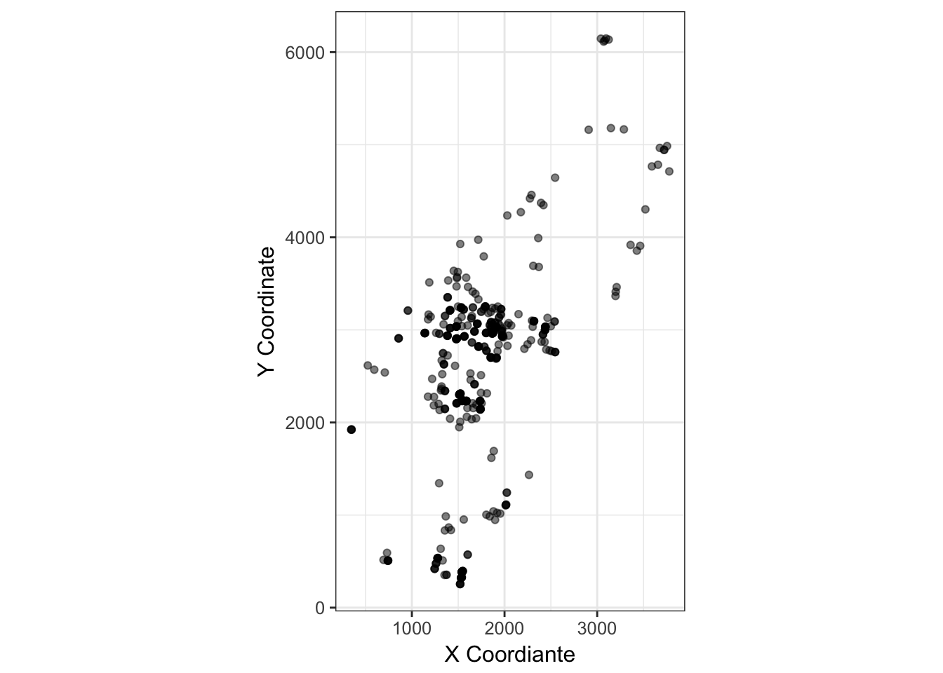
(#fig:dogwood_coords)Spatial distribution of adult Cornus florida trees on the landscape.
This is a common feature in plant populations. Limitations to seed dispersal are generally more severe than spatial limitations in pollen dispersal. As such, proximate individuals are positively correlated due to potential co-ancestry. If the dispersal processes are reversed, this is not so much of an issue. Pollen is from near neighbors but seeds are randomly distributed—the spatial location of individuals is independent of genetic correlations. As such, pollen and seed have different contributions to spatial structure, limitations in pollen dispersal can only enhance structure caused by limitations in seed dispersal. So for the individuals in the map how does this manifest? We can estimate inter-individual distances for both physical and genetic separation (n.b., I use inter-individual AMOVA distance here) and then look for any relationship.
coords <- strata_coordinates(cornus, stratum = "SampleID", longitude = "X.Coordinate", latitude="Y.Coordinate")
P <- strata_distance(coords, mode="Euclidean")
G <- genetic_distance(cornus, mode="AMOVA")
We can test for positive spatial autocorrelation. Here I use the approach of Smouse & Peakall (1999) that fits within the normal AMOVA framework. Normally, we examine the relationship between physical and genetic distance as in a spatial autocorrelation process. Overall, a trend suggests a limitation in overall combined dispersal.
df <- data.frame( Physical=P[lower.tri(P)], Genetic=G[lower.tri(G)])
ggplot( df, aes(Physical,Genetic)) + geom_point() + stat_smooth(method="gam")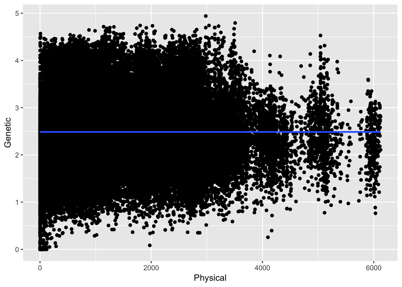
Here the relationship between physical and genetic distances are taken with respect to all the data across all the distances. In this case the overall correlation (if that is even appropriate) is \(\rho =\) -4.823045210^{-5}. However, we expect the relationship to be asymptotic in that at certain distances there should be some relationship and at larger distances it should be roughly random. Here are the data separated by just up to 25 units.
ggplot( df[ df$Physical < 25,], aes(Physical,Genetic)) + geom_point() + stat_smooth(method="loess") + geom_jitter()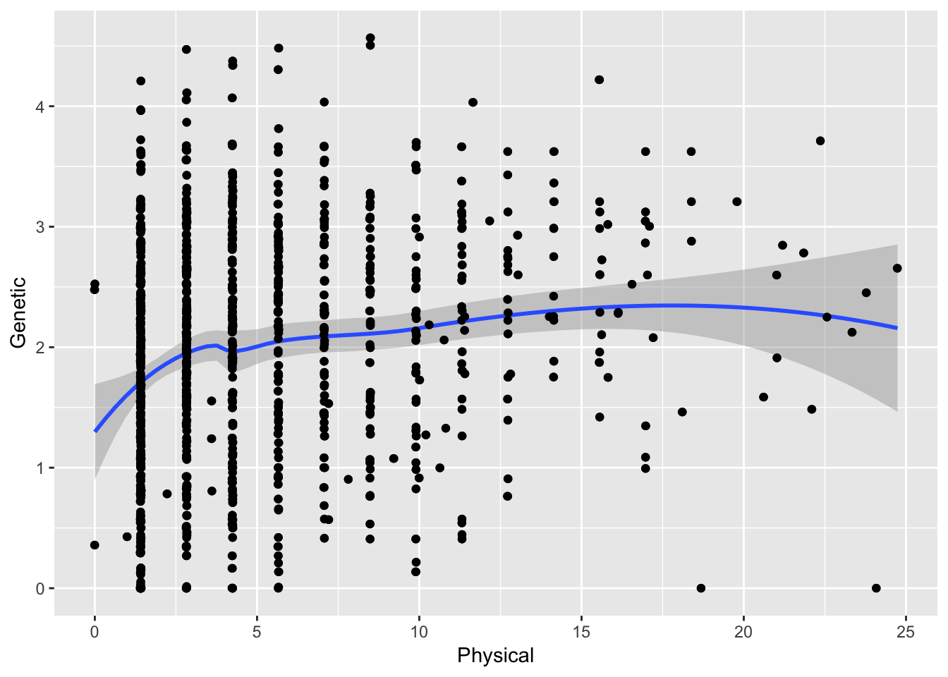
which gives a different overall correlation ( \(\rho =\) 0.1810624). Quite different!
To proceed, we must thus define the spatial bins in which we can categorize individuals and estimate genetic correlations. We can test the significance of the estimator by permuting individuals across distance classes and re-estimating the parameter. These data can be plot as:
df <- genetic_autocorrelation(P,G,bins=seq(0,1000,by=100),perms=999)
df$Significant <- df$P <= 0.05
ggplot( df, aes(x=To,y=R)) + geom_line() +
  geom_point( aes(color=Significant), size=4) +
  geom_abline(slope=0,intercept=0, linetype=2) +
  xlab("Physical Separation") + ylab("Genetic Correlation")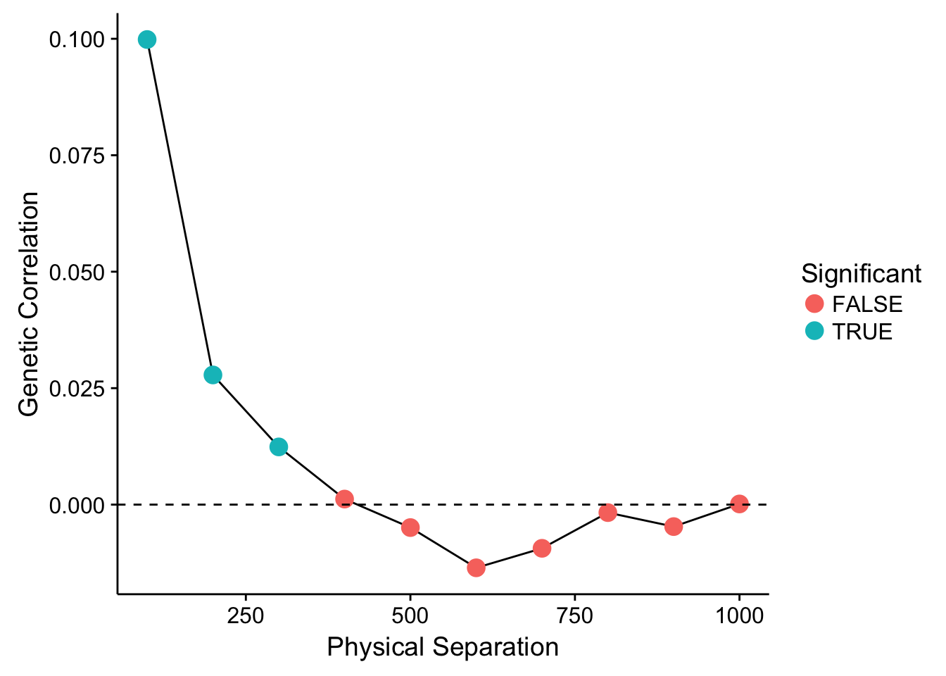
Showing that for the first three distance lags, there is a significantly positive (at \(\alpha=0.05\)) correlation between individuals. After that distance, it levels out and we could consider it to be random. The parameter estimated for each distance class is a true correlation and is defined as:
\[ r^h = \frac{\sum_{i\ne j}^K x^h_{ij}c^h_{ij}}{\sum_{i = 1}^K x^h_{ii}c^h_{ii}} \]
But what if we want to get a hold of this spatial component in our data and perhaps even extract it out so it does not bias our estimates?
What happens if we change the size of our bins?
library(cowplot)
df1 <- genetic_autocorrelation(P,G,bins=seq(0,1000,by=25),perms=999)
df2 <- genetic_autocorrelation(P,G,bins=seq(0,1000,by=50),perms=999)
df4 <- genetic_autocorrelation(P,G,bins=seq(0,1000,by=200),perms=999)
df1$Significant <- df1$P < 0.05
df2$Significant <- df2$P < 0.05
df4$Significant <- df4$P < 0.05
p1 <- ggplot( df1, aes(x=To,y=R)) + geom_line() +
  geom_point( aes(color=Significant), size=4) +
  geom_abline(slope=0,intercept=0, linetype=2) +
  ylab("Genetic Correlation") + xlab("") +
  theme(legend.position="none") + xlim(0,1000)
p2 <- ggplot( df2, aes(x=To,y=R)) + geom_line() +
  geom_point( aes(color=Significant), size=4) +
  geom_abline(slope=0,intercept=0, linetype=2) +
  xlab("") + ylab("") +
  theme(legend.position="none") + xlim(0,1000)
p3 <- ggplot( df, aes(x=To,y=R)) + geom_line() +
  geom_point( aes(color=Significant), size=4) +
  geom_abline(slope=0,intercept=0, linetype=2) +
  xlab("Physical Separation") + ylab("Genetic Correlation") +
  theme(legend.position="none") + xlim(0,1000)
p4 <- ggplot( df4, aes(x=To,y=R)) + geom_line() +
  geom_point( aes(color=Significant), size=4) +
  geom_abline(slope=0,intercept=0, linetype=2) +
  xlab("Physical Separation") + ylab("")+
  theme(legend.position="none") + xlim(0,1000)
plot_grid(p1,p2,p3,p4,ncol=2)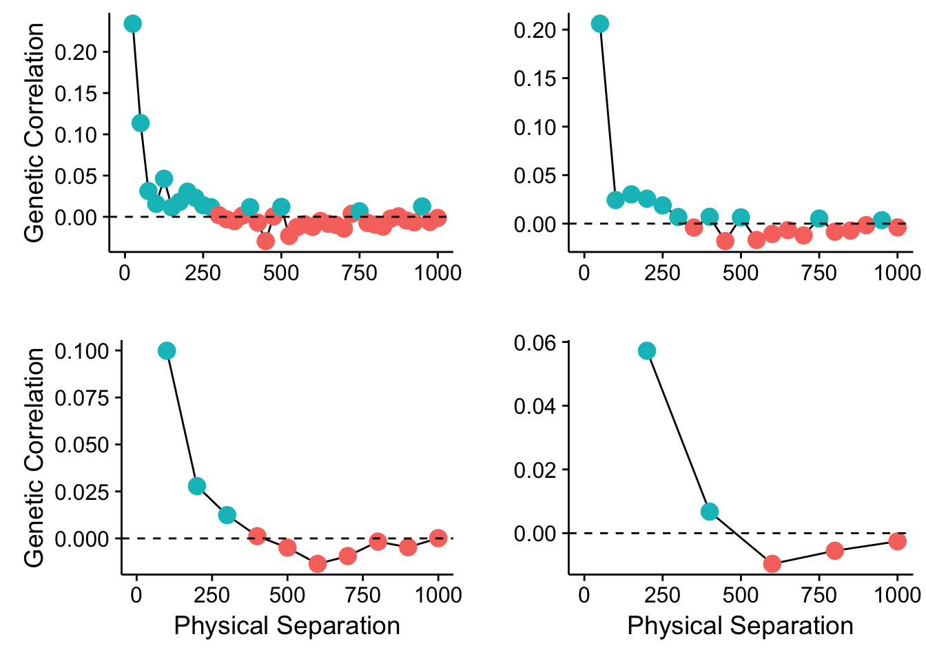
Figure 35.1: Spatial autocorrelation in the Cornus data set using different bin sizes.
So what does this mean? Can there be many different spatial patterns nested within our populations? How can we evaluate which spatial scale has some kind of genetic autocorrelation? And more importantly, how can we regress it out of our data so we can get to asking the real questions we are trying to ask?
35.1 Eigenvectors & Eigenvalues
Both eigenvectors and their matched eigenvalues are somewhat mysterious mathematical creations that we ran across already in the section on ordination. The general eigen equation is given as:
\[ \mathbf{A} \vec{v_i} = \lambda_i \vec{v_i} \]
where \(\mathbf{A}\) is a matrix, \(\vec{v}_i\) is the \(i^{th}\) eigenvector and is associated directly with the \(i^{th}\) eigenvalue \(\lambda_i\). For any matrix, the number of corresponding eigenvectors and associated eigenvalues will be equal to the minimum dimensionality of \(\mathbf{A}\). In most cases, we will be using symmetric matrices so our row and column count will be equal. However, we will have at most \(det(\mathbf{A})\) non-imaginary eigenvalues associated with any matrix.
One way to think about eigenvalue/eigenvector pairs is via its use in spectral matrix decomposition. Just like any number or polynomial equation, a matric can be factored into an additive set of matrices. These matrices can be further defined as an eigenvector product scaled by the eigenvalue. For example, the matrix \(\mathbf{A}\) can be decomposed into:
\[ \begin{aligned} \mathbf{A} &= \sum_{i=1}^\ell \mathbf{B_i} \\ &= \sum_{i=1}^\ell \vec{e_i}\vec{e_i}^\prime \lambda_i \end{aligned} \]
where the vector \(\vec{e_i}\) (and its transpose-the one with the prime on it) create the matrix \(\mathbf{B_i}\) after the scaling factor \(\lambda_i\). This decomposition is esstentially what we are doing and the meaning of the \(\vec{e}\) and associated \(\lambda\) values depend upon how the original matrix \(\mathbf{A}\) is constructed.
For distance matrices, we can extract certain kinds of eigenvalue/eigenvector pairs that have interesting interpretations and aid in our understanding of latent spatial structure. The next few sections show a few different ways we can determine the scales at which spatial structure may exist as well as how to correct for it. Before we go into it, we should clarify a few definitions. What we call the decomposition of data using eigenvalue/eigenvector has several different names, depending upon what kind of data you are starting from. If we are to start from a raw set of data, say \(N\) observartions with \(p\) variables on each observation, say the coordiante data from the dogwood trees above:
X = as.matrix( coords[,2:3])
dim(X)
## [1] 451 2decomposing this in into eigenvalue and eigenvector pairs is called Principal Components Analysis (PCA).
fit <- princomp(X)
fit
## Call:
## princomp(x = X)
##
## Standard deviations:
## Comp.1 Comp.2
## 1129.8794 428.0675
##
## 2 variables and 451 observations.You can see that we get as many axes as the minimum of independnet rows or columns. Here we have 451 observations and two coordinates leaving us two principal components (denoted as Comp.1 and Comp.2 in the output above). The princomp() rotation is essentially a method to take your original data in 2, 3, or as many dimensions as you have, and create a new synthetic set of data vectors based upon linear combinations of the original ones. These new variables are derived such that they maximize the amount of variation in the data along sucessive axes—the first axis is constructed such that the variation of data along it is the largest, the second synthetic axis is has the second largest amount of vatiation while being at a right angle to the first one, etc. Each of these orthoginal axes are ordered in decreasing magnitude of how much of the vatiation they describe in the original data. This is depicted below in the image showing a rotation of the original data onto new synthetic axes.
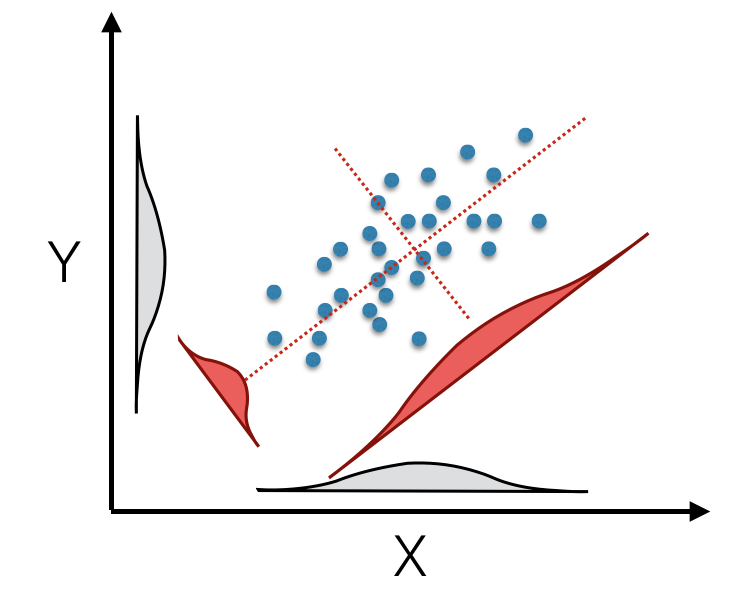
(#fig:pca_rotation)Principal component rotation of bivariate data mapped from original axes (black X- and Y- axes) onto new coordinate axes (dotted red) that maximize the variation on each of the new axes (displayed as density insets for original and tranlated axes).
The original data for each observation, \(\vec{x_i}\), is translated into the new coordinate space, \(\vec{\hat{x}_i}\) by multiplying it by the first eigenvector.
\[ \vec{\hat{x}} = \vec{e}\vec{x_i} \]
To see this rotation, we can
library(cowplot)
cornus_rot <- data.frame(predict(fit));
cornus_rot_plot <- ggplot(cornus_rot, aes(x=Comp.1, y=Comp.2)) +
  geom_point(alpha=0.5) + coord_equal() +
  xlab("X Coordiante") + ylab("Y Coordinate") +
  theme_bw() + coord_equal()
plot_grid( cornus_plot, cornus_rot_plot, rel_widths = c(2,3), labels=c("A","B"))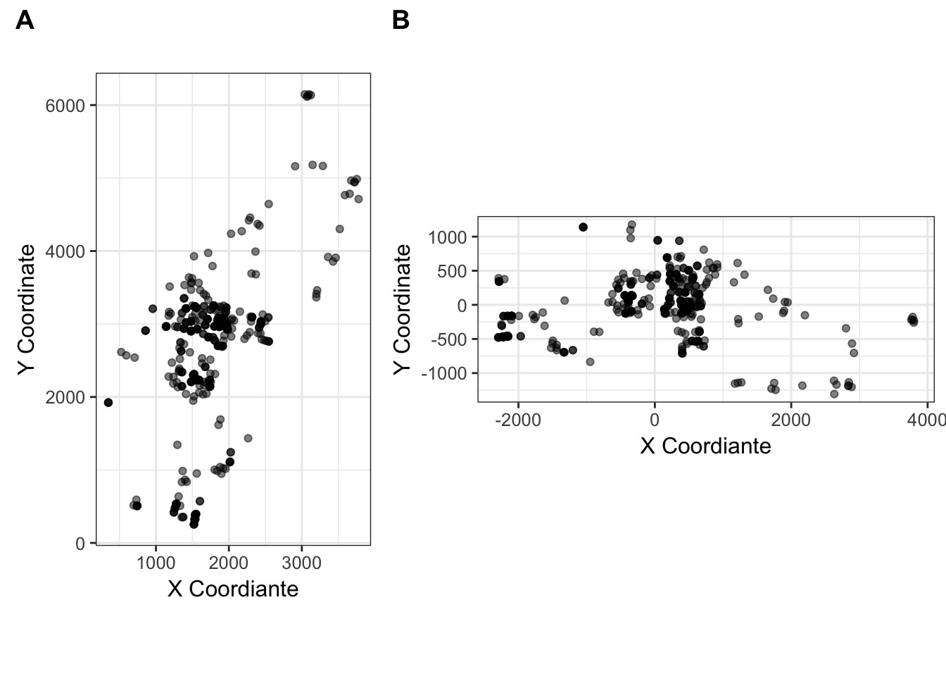
Figure 35.2: The (A) Original, and (B) rotated coordiantes for the Cornus data set.
If we work on a derivative of the original data, say we take the coordinates and measure the distances between them (the P matrix from the code above), and then decompose it into eigenvalue/eigenvector pairs, it is called a Principal Coordinate Analysis.
pca_P <- princomp(P)
cat("PC Axes: ",length(pca_P$sdev))
## PC Axes: 451Both the Component and Coordiante approaches do the same thing–decompose the matrix into a set of eigenvector/eigenvalue pairs–they just start with different original data. With this out of the way, we can start playing around with the
35.2 Principal Coordinates of Neighborhood Matrices.
The distances between all the trees shown in the map above provide a common inter-individual distance matrix, \(\mathbf{P}\). Borcard & Legendre (2002) provided one approach for uncovering spatial patterning in a response data set (say \(\mathbf{D}\) above) based upon a manipulation of the inter-locale distance matrix (\(\mathbf{P}\)) called Principal Coordinates of Neighborhood Matrices (PCNM). What this approach does is take the spatial coordinates of indiviudals and decomposes the pair-wise distance matrix using a Principal Coordinate decomposition.
- Your data are defined as: \(Y = f(X)\), along one dimension. In this case, we have \(N\) measured observations with a single response (\(\vec{y}\)) and \(N\) corresponding predictor (spatial) variables (\(\vec{x}\)).
- We define a pairwise inter-neighbor distance matrix of the predictors, \(\mathbf{D}\). This can be Euclidean, great-circle, or any other distance metric.
- From this neighbor matrix, we set a maximum distance, \(d_{max}\). This distance is the size of the neighborhood we are interested in investigating.
- In \(\mathbf{D}\), set all values of the inter-observation distance that are equal to or greater than \(d_{max}\) equal to \(4*d_{max}\). All values of \(md_{max};\; m >= 4\) are suggested to be asymptotically similar in the results that follow.
- Take a principal coordinate rotation on this matrix and retrain the eigenvectors whose eigenvalues are non-zero, (e.g., \(\lambda_i > 0\)). These constitute your new set of predictor variables for subsequent analysis via regression, canonical correlation, redundancy, etc.
In this example, I’m going to use the dogwood data and look for spatial trends. In this example, I’m just going to take the largest axis of varaition among individual genotypes (e.g., turn genotypes into a multivariate vector then do a PCA rotation on the genotypes and keep the first, most important, variable as a predictor).
cornus_mv <- to_mv( cornus )
cornus_rot <- princomp(cornus_mv)
new_cornus_genetic <- predict(cornus_rot)
qplot(new_cornus_genetic[,1], new_cornus_genetic[,2], geom = "point") + xlab("Synthetic X1") + ylab("Synthetic X2") + theme_bw()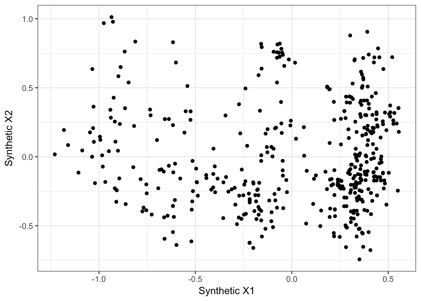
Next, we can take the spatial coordiantes and distance matrix that we derived previously and decompose it via a Principal Coordinate Rotation (which we already did). The PCNM approach is encoded in the vegan library but to use it, we need to define a distance threshold first. If we look at the distribution of spatial autocorrelation above, perhaps something around \(250\) would be appropraite.
library(vegan)
threshold <- 200
pred_pcnm <- pcnm(P,threshold)
We can visualize these new predictors by plotting the synthetic values in 2-space.
ordisplom( pred_pcnm, choices=1:4)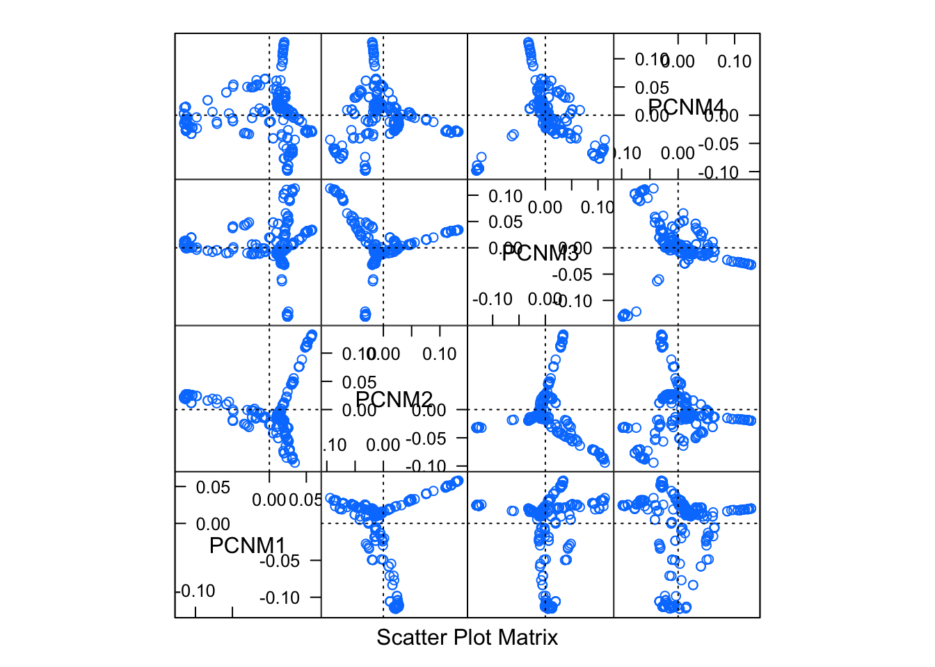
Then we can try to build up a multiple regression model, using these new PCNM axes as predictors and the first genetic structure variable as the response.
resp <- new_cornus_genetic
min_resp <- min( resp )
resp <- resp + ceiling( abs(min_resp))
pred <- scores(pred_pcnm)
ord <- cca( resp ~ pred )
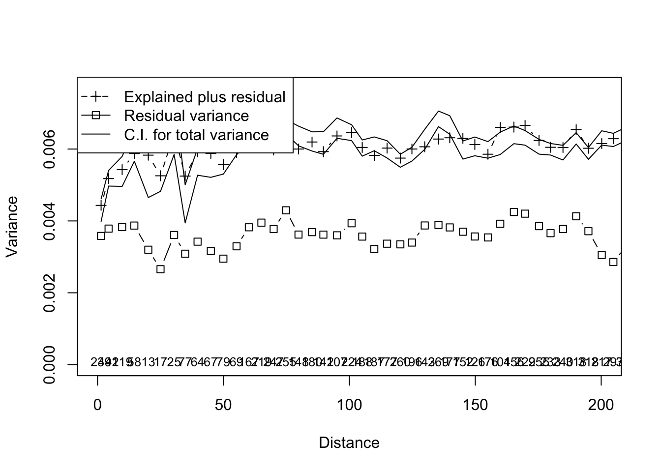
multiscale_ord <- mso(ord,coords[,2:3],grain = 5)
msoplot(multiscale_ord,xlim=c(0,200))